
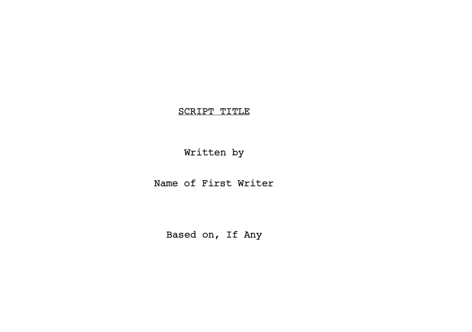
Presenting your screenplay to the industry starts with how the whole package looks, not just the words inside it. Decisions about a script get made fast, sometimes upon a cursory scan or first glance. And where this glance lands first is your Title Page.
First Impressions Really Do Matter
Before an agent, manager, or producer reads a single line of description, they've already formed an opinion of you. That opinion comes from a page with only basic info: a title, a name, and your contact information.
Your title page is the smallest amount of real estate in the entire document, but it's doing a lot of work: it's acting as an introduction.
A cluttered, sloppy, or over-designed title page tells the reader something before your story gets the chance to. A clean and professional-looking title page tells them you know what you're doing.
Your Title Page Is Already Telling a Story
There's an additional opportunity to convey something about your script via your title page. The font you choose, the spacing, B&W or color, and the level of restraint or flamboyance you display all send a signal about tone and genre before the reader turns the page.
A stark, condensed typeface reads differently than a looser, more casual one. A horror script in a jagged, distressed font promises something different than the same title set in clean, centered Courier.
None of this should overwhelm the page. A quiet signal works better than a loud one.
A prestige drama in a heavy, ornate serif is making a promise about pace and weight. A broad studio comedy in something rounder and friendlier is making a different one.
The reader hasn't opened your script yet. Your title page format has already told them what kind of ride to expect. This is craft applied to presentation.
Your title page sets your screenplay's tone, and it should work with everything that follows it.
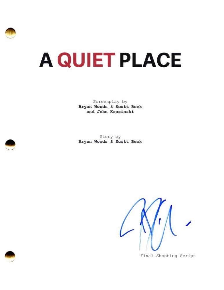
Keep the First Page Simple
For all of its signaling potential, the format for a title page for a screenplay shouldn't stray too far from established structure. Title page screenplay formatting should follow industry standards and include the following: the script's title, the writer's name, contact information, and, if relevant, a "Based On" credit for adapted material.
Resist the urge to add a logline, a synopsis, or a stack of festival laurels. None of that belongs on a script's title page. These embellishments will suggest you're a writer who doesn't trust the pages behind it to do the talking. The title page format works because it's restrained, and restraint is a professional signal in itself.
Contact information deserves the same discipline. An email address and a phone number are enough. Unless it's somehow relevant to the script, you shouldn't be including social media handles or links. Also, including a home address isn't necessary since, in most scenarios, you'll be sharing your script digitally and not via snail mail.
If you've registered your script with the WGA or hold a copyright number, that can go in a small corner near your contact information, but it's optional. The people reading your title page script information don't need proof of registration to take the material seriously. The writing in your first couple pages should do that.

Images in Title Pages?
This used to be frowned upon back in the day, but in recent years, readers have become more accustomed to images being used in screenplays. An image can do real work on a title page, especially for a high-concept idea or a project built around a real event. However, restraint should still be applied, and you have to ask yourself: 'Does an image serve the kind of script I've written?'
Biopics and historical dramas are genres where inserting an image can be useful. A single photograph of the real person your script is about, or an image that captures an event or the era, tells a reader more at a glance than a descriptive paragraph could. It signals research and authenticity, and it gives the reader a clear sense of what the finished film should feel like before they've read a word of it.
The mistake is cramming that image onto the same page as your title, your name, and your contact information. A busy title page looks unprofessional no matter how good the image is. The more effective move is adding a second title page. First you have your clean, standard title page, and then you follow it with a page break into the image: a photo of the real person your biopic is centered on or a period photograph that establishes the era for your historical drama.
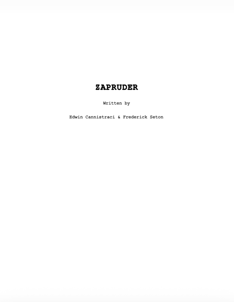
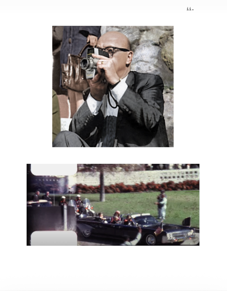
You can also use a single evocative image for a high-concept idea (effective for an action or horror script). Regardless of the genre, using a second title page for an image functions as a visual bridge between your title page and page one of the script itself, letting both pages do their job without competing for the reader's attention.
Setting Up the Title Page in Final Draft
Final Draft, in addition to automated industry-standard formatting, has a tool specifically designed for creating your script's title page.
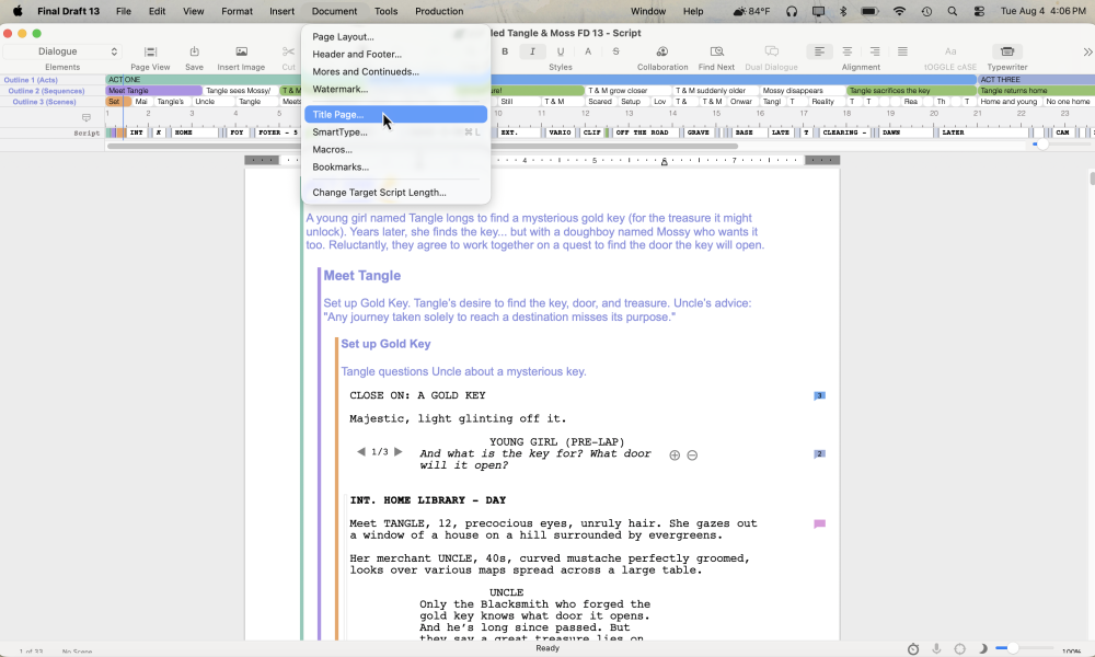
Go to Document > Title Page.
This opens your script's title page in its own document window. This template is separate from the body of the script, pre-formatted to industry standard spacing (it's also free for all Final Draft users).
Type your title, your writer credit, and your contact information directly over the template text, delete anything you don't need, and close the window. Save the script, and the title page saves with it.
That's the entire process for creating a title page that looks professional. No guesswork about margins, no manually centering text, no risk of formatting drift between your title page and the rest of the script.
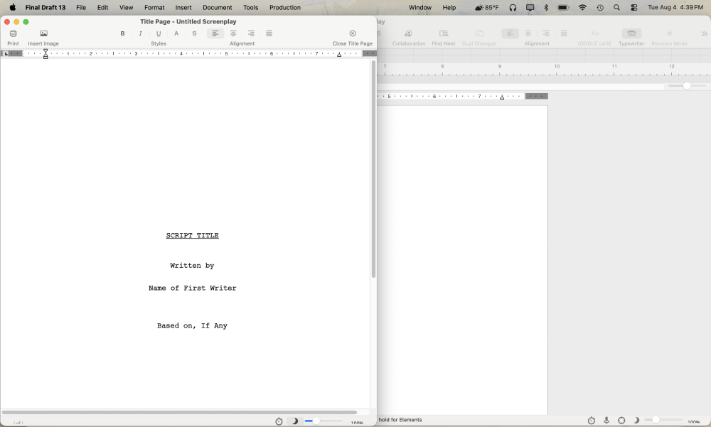
If you're adapting your title page from an outside source, credit order matters, and Final Draft's template leaves room for it. A "Based On" line goes beneath your writing credit, positioned after "Written by" or "Screenplay by" but before any note on revisions.
If you're revising someone else's draft, a "Revisions by" line follows the same pattern, dated and placed after the original writer's credit. This mirrors how the industry actually tracks who worked on a script and keeps your draft from getting confused with an earlier one.
Adding Images Without Overloading the Page
Final Draft's image support makes it easy to add an image to your title page.
Go to Insert > Image, or simply drag an image file from your desktop directly into the title page document (regardless of whether it's a first or second page).
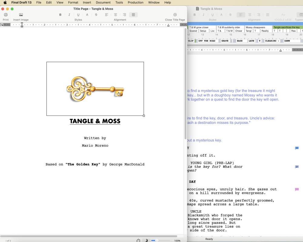
Keep image files under 1MB. Larger files slow down open, close, and save times. A script that lags every time you touch it will make for a frustrating first impression. The goal is to make things easy for the reader.
Multiple Title Pages, Numbered the Right Way
Once you've decided to add a second page — whether for an image, a cast list, or a location list — building it is a single command.
Position your cursor at the end of the existing title page and go to Insert > Page Break. Final Draft adds a new title page automatically, and every additional page you create this way stacks the same way.
These pages number themselves in Roman numerals rather than the standard numbering your script pages use, which keeps them visually distinct from the screenplay itself. If you'd rather they carry no numbers at all, go to Document > Header and Footer and remove the Page field. Either way, you're the one making the call.
Locking It Into the Final PDF
A title page that's part of a Final Draft document will eventually have to venture out into the world. When you export, go to File > Save to PDF, and check "Include Title Page" in the window that opens.
Once you check that box, your PDF document will have a title page and any additional title pages, and the actual screenplay pages will follow. Managers and producers opening the document will immediately see your title page, and it will signal professionalism.
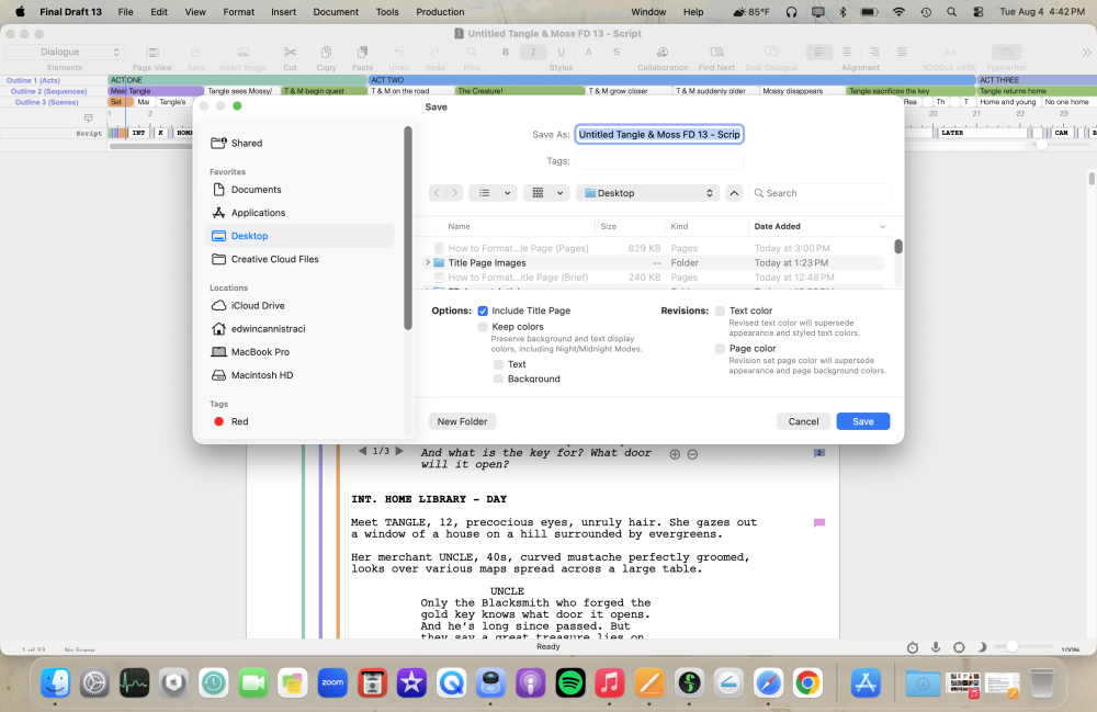
Final Draft 13 goes a step further, letting you carry your script's display colors, both text and background, into the exported PDF. This is done by opening the Save to PDF window and checking Keep Colors.
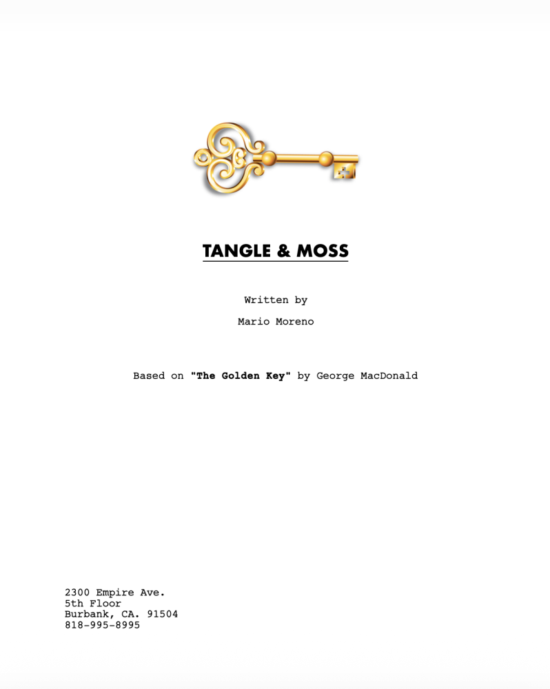

A dark, Night Mode-styled PDF can work well for a pitch document paired with your script, though a standard screenplay is usually better served by staying legible and unadorned. Your genre and your judgment decide whether to use it.
The Primary Job of a Title Page
A title page for your screenplay or TV pilot only has to do a few things: state the title, credit the writer, provide contact information, and, when the material calls for it, set a mood with the right font or image.
Title page formatting stays simple by design, and that simplicity is exactly what reads as professional to the people deciding whether to keep going.
Final Draft handles the mechanics, from creating the title page and image support to allowing you to lock it into a custom PDF document. How much customization and embellishment is ultimately your decision.
Ask yourself, 'What kind of first impression do I want to make with my title page?' Script readers, managers, and producers all form that impression before they read a word of your story.
Make sure it's the one you meant to give them.